Component Design
Call To Action Icon Component | Form Component | Logged Out Component
1. Call to Action Icon Component
5 icon CTA component for footer, Consumer Banking example.
4 icon CTA for Right Rail, Consumer Banking example
Situation
Design one reusable CTA component to use across public-facing dotcom pages, replacing the more than 5 components currently being heavily used sitewide. Optimized for reusability, A11y, ease-of-use and updated to reflect the most current design system release.
Solving for:
Customers: create a cohesive and consistent CTA user experience across public-facing site
Accessibility: create a fully-accessible component experience
Authors: create a more simple and intuitive author experience for both power users and novices; eliminate ability to hack styles and/or inadvertently introduce accessibility defects
Developers & Testers: create one reusable component using tokens to display the correct branding (versus building a unique component for each U.S. Bank brand)
UX: implement Shield design patterns
My Role
I was the sole UX designer collaborating on a small journey team consisting of the Product Owner, Scrum Master, 1 AEM author, 2-3 remote developers. I worked closely under the direction of the department’s UX Design Lead and UX Producer.
Approach
The design of this CTA component spanned the scope of 3 sprints:
Analysis and competitive research into how other Best In Class company websites used Call To Action
Concept and design. Communicating with other journey teams in an attempt to align on this undertaking.
Refinement of design with A11y and final approval from Design Directors
Tools
Sketch
InVision
Jira
AEM
Solution
a section of the Sketch file
Personal Banking and Wealth management have distinct colors and icons that they use. Design decisions were updated to the most recent styleguide and careful attention was spent maintaining that the distinct icons and colors adhere to their category.
An extensive Sketch file covered all variations of color combinations, icons and text alignment, across responsive sizes: desktop, mobile, and tablet for the Footer CTA and Right Rail component.
Additionally, a Sketch file of the Authoring Environment was designed for layout options and was included in the developer handoff.
Higher resolution documentation available upon request.
Page mockups of NEW CTA component
Higher resolution examples available upon request.
2. Applying Shield Design System to The AEM Global Form Component
Situation
Updating global form components to the Shield style guide and designing a solution for the long label text area.
Placing instructive text above the enabled text input line, using floating labels , and utilizing a progressively expanding text area.
My Role
I was the sole UX designer collaborating on a small journey team consisting of the Product Owner, Scrum Master, 1 AEM author, 2-3 remote developers. I worked closely under the direction of the department’s UX Design Lead and UX Producer.
Approach
Analysis and competitive research into how other Best In Class company websites use forms and text input.
Concept and design. Communicating with other journey teams to align on the Shield design system.
Refinement of design with A11y and final approval from Design Directors
Tools
Sketch
InVision
Jira
AEM
Text box with scroll bar, not best practices.
Text label floats upon text entry. Text space is responsive so all input is visible.
Updated form: text input is responsive and in line with Shiel style guide.
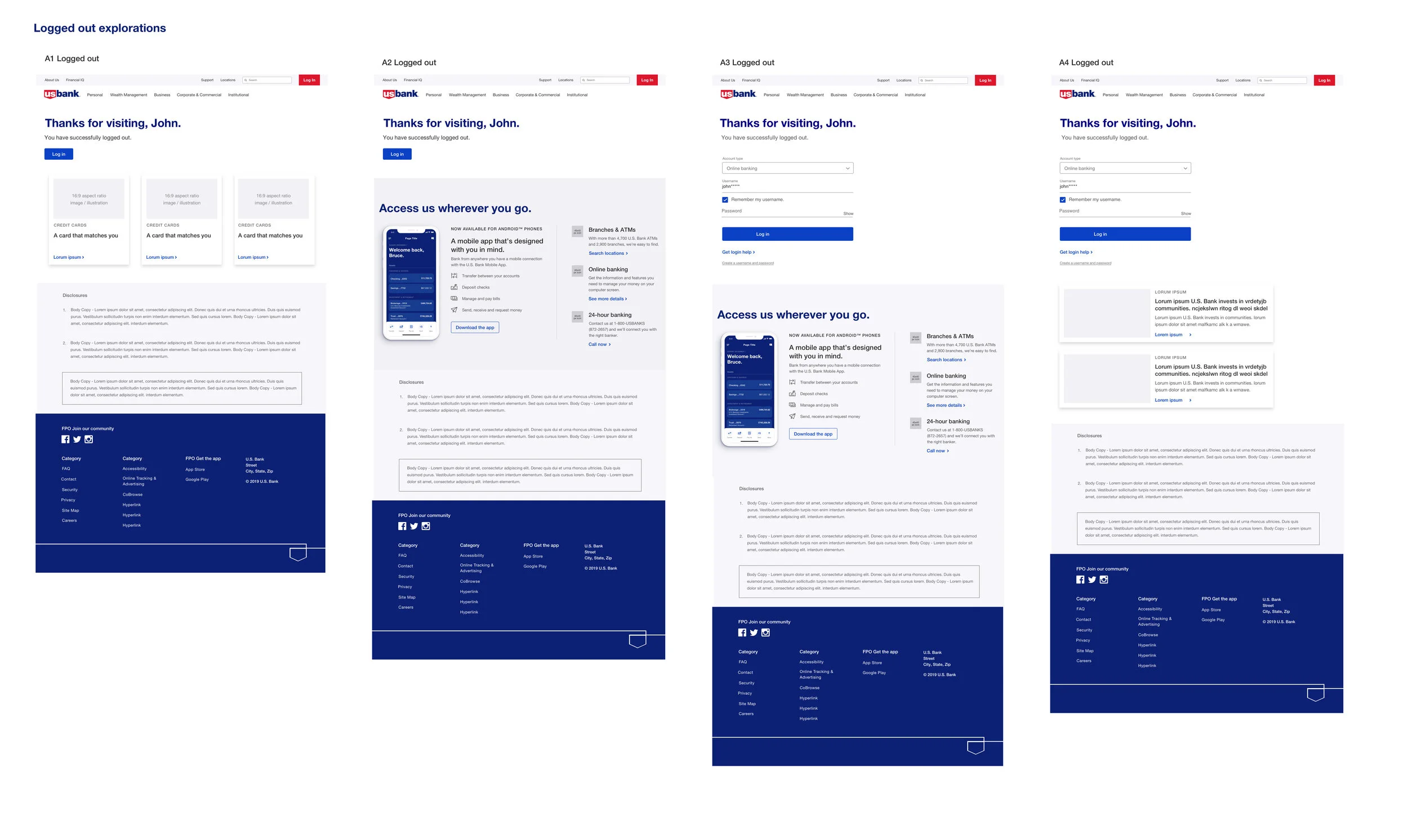
3. New & Improved Logged-off global component
Situation
Implementing Shield design patterns and optimizing the logged-out experience for online banking users. We are providing a contextual and useful experience from beginning to end by confirming a successful log out, giving thanks, and seizing the opportunity to present relevant products and services to the online banking user.
Solving for:
This will be an online banking global component for use by AEM authors and designers.
It will provide a consistant and personalized user experience for all online banking users.
My Role
I was the sole UX designer collaborating on a small journey team consisting of the Product Owner, Scrum Master, 1 AEM author, 2-3 remote developers. I worked closely under the direction of the department’s UX Design Lead and UX Producer.
Approach
The design of this global component spanned the scope of 3 sprints:
Analysis and competitive research into the log-out experience with other Best In Class companies in the banking and healthcare fields.
Concept and design. Communicating with other journey teams in an attempt to align on this undertaking. Exploring what this could look like with available style guide options.
Refinement of design with A11y and final approval from Design Directors
Tools
Sketch
InVision
Jira
AEM
The current online banking experience for a user being logged out due to inactivity or when intentionally logging out had much room for improvement.


